For inspiration for my wood elf team I scanned the interwebs. I saw a lot of green and yellow, green and blue, and green and brown teams out there. I didn't care for them. I saw some green and red schemes that attracted me more but they still weren't right. Then I remembered a video
Les Bursley at Awesome Paint Job did a while ago and decided to watch it again. It doesn't feature Blood Bowl but I liked the scheme. He went with a reddish brown, orange, a greenish khaki, and gold metallic. I decided to go with a variation of these colors, sort of a fall theme.
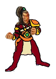
I often work up a drawing to out color schemes and this was no exception:
So I put this together and did a quick and dirty test figure:
I didn't like it. I went back to the video and saw my colors were off. So here is another markup:
So I gave that one a shot, used same model since it was just increasing contrast:
Better and truer to the scheme I wanted. I brightened the orange and darkened the pajama brown. I also gave the cloth a greenish tint. Little pop of bright from the feather too.
By next week I'd like to have the team done. Hopefully, I can find time for a couple hour block to hammer a big chunk of it out with the airbrush. I decided to paint the pajamas with that to speed it up, if I can.


I like the look! It's a bit muted but still stands out.
ReplyDelete